The big one is broad sheet.
Small one is tabloid
Most tabloids are 24 pages
Road sheets have about 12 or 16 pages
Broad sheet of paper the average number of stories is gonna be 3-5
Tabloids can only fit 1and maybe 2
Being on the front page means they (stories) are the most important
News value
The flag is the name of the newspaper
A teaser is above the flag
Teasers do not have to have photos
Folio
* The place where the newspaper is going to be found
* The date
* The motto
* Price tag
* The website for the newspaper
* Recycling sign
Every good newspaper should have a headline
The headline should be written for the first paragraph
Headline should be interesting
Sub headline tells more information about the story
Should have at least one sub headline on every page
By line tells you who they are and what their job is on newspaper
Have to have stories in newspapers
Pages should have pictures in them and have a dominant photo
Caption has three parts:
*Caption head
*Photo by
*Actual caption itself
1st Sentence who what where and when
2nd Sentence gives you background info on the photo
Sometimes have to write more sentences if there is more space to fill in
Can write more background info to fill up space
Can include a quote to fill up space
Little boxes on the side of stories are called info graphics
Info graphics have additional info that are not available in the story
Design element at the bottom of the newspaper:
*Table of contents
*The volume number
*Issue number
Others might have the number of the newspaper
Staff Box or Mast Head:
*Editorial policy
*Organizations
*The staff
2/28/12

Front Pages Of The World
1. Observer-Dispatch
Utica, New York
2. Survey: Teen On The Rise because it talks about the current issues for most teens.
3. There are six stories on the front page of my favorite
4. There is always big text as the headline and has the most important thing to say. Always a big picture in front of a newspaper
5. The Headline doesn't always go with the picture.
Utica, New York
2. Survey: Teen On The Rise because it talks about the current issues for most teens.
3. There are six stories on the front page of my favorite
4. There is always big text as the headline and has the most important thing to say. Always a big picture in front of a newspaper
5. The Headline doesn't always go with the picture.
2/8/12


1/27/12

1/23/12
Magazine Covers Part 2 And InDesign Part 1
EARLY MAGAZINE COVERS
Most of the early magazine covers didnt have pictures like most magazines today. Then the first cover was a table of contents. When they did use covers they usually looked like covers of books, with more words than pictures. There were no little words on the sides of the magazine cover explaining some things that were in the magazine. Sometimes some magazines had a symbolic cover. The symbol usually meant something to explain what the magazine was a little bit about. Then they started having magazines for women. The cover usually had very well drawn pictures of different roles of women in the family.
THE POSTER COVER
This type of magazine cover was more used in 1890s to the 1960s. Many of the pictures look like paintings you would see hanging on someones wall because how good they looked. The poster magazines were bigger then the magazines today. The poster cover had, little or no, little explination of the magazine on the cover.
PICTURE MARRIED TO TYPE
In the early 1900's they started adding dialogue to there cover art. They were starting to use huge titles with a persons head covering some of it, a model posing with nearly whole body, or words surrounding the model instead of going over the models body.
1/19/12
Happy, Akins, Building

It is an excellent example of my work because I fixed the photo into looking less bright.
It shows happy since the mask has a creepy smile.

It is an example of my work because before I photo shopped it, it didn't look like the colors were popping on the photo.
Its a good example of Akins since the mascot of Akins is the Eagle.

It is an excellent example of my work because it shows rule of thirds.
It shows building since its a building.
1/12/12
Choice Sheets
I am interested into bieng in yearbook. Yearbook always seemed like fun. You get to go to some of the events at school and take pictures of people and get to create memories for them. Yearbook is a way to capture events that some people may not have known about until they saw it on the yearbook.

Welcome Back(:
June

This is my favorite picture because its funny how tigger from "Winnie The Pooh" is at gun point.

I like this photo because its funny having a child rodeo kind of thing going on.

12/13/11
Shortlist warm up

I like this photo because it looks like the pier just stretches out all the way out to the middle of the ocean.

I like this photo because it looks like he's sunken all the way back in an ocean of shoes!

I like this photo because the awkward position of the models body

I like this photo because the way the baby looks lost in between all the tall people.

I like this photo because I like the way you can really see the color of green eyes.

I like this picture because the snake is right next to the little kid and most kids would run away from snakes.

I like this photo because it looks like a garden under the sea.

I like this photo because it looks so unreal

I like this photo because it seems like it belongs in a fairy tale book or fairy tale movie.

I like this photo because it like the way the silhouette of the girl looks


12/9/11
Magazine Cover Introduction:
1) The subject of the photo catches the readers attention
2) That people will actually buy the magazine
3) It will catch peoples attention
4) Make It Interesting
5) Dont judge the photo
2) That people will actually buy the magazine
3) It will catch peoples attention
4) Make It Interesting
5) Dont judge the photo
12/7/11
Lytro Warm-Up
1.When I clicked on the photo where ever I clicked that part became more focused and the other things in the picture were not in focus.
2. New kind of sensor called a light field sensor.
3.The photographer would have to know in what point of view the photo should be taken in.
4.Yes
2. New kind of sensor called a light field sensor.
3.The photographer would have to know in what point of view the photo should be taken in.
4.Yes
Rules of Photography Part II
Rule Of Thirds

Balancing Elements

Leading Lines

Symmetry
(Because one eye has makeup so you notice that before anything else)

Viewpoint

Background

Depth

Framing

Cropping

Mergers
(Girl in the background arm is out of the picture)

12/5/11
Self Portrait and Portraits Part II
1)The most common mistake made by photographers is that they are not physically close enough to their subjects. In some cases this means that the center of interest—the subject—is just a speck, too small to have any impact.
3)A great deal of people photography is understanding human nature and being aware of how people usually react in given situations.
4)

 I like the setting of both the pictures. It has a very relaxing feel to the photo's.
 5)


I like the photo's because they look very cool and unique. And that's the same reason I chose them.
6)

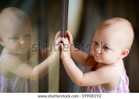
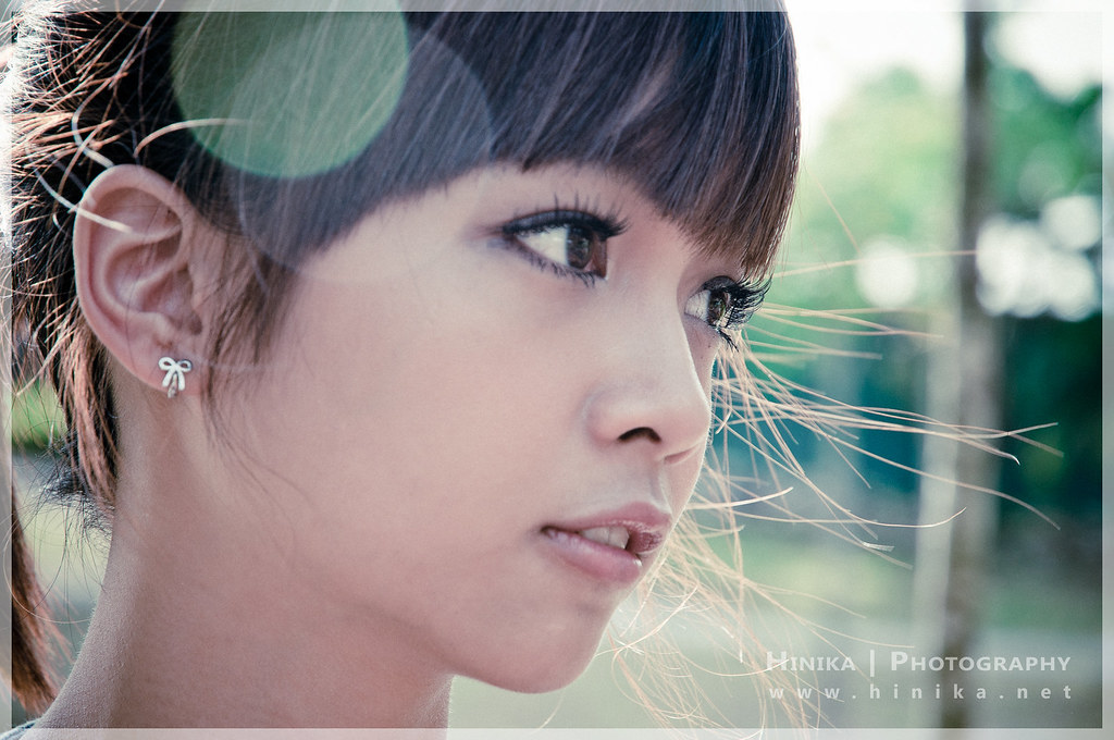
I like these photo's because they are both very nice and It's pictures of just normal people doing normal things. like the girl at a park (I think) and the baby playing with it's reflection.
7) I will be shooting Nancy. We will be shooting in the front of the school since there is different places to take the picture like the small "garden" we have in the front. What I'll do to make the photo successful is I will make sure that the setting on the camera is right and I will use some rules of photography.
11/29/11
Portraits and Self-Portraits
1) Self-Portraits


4) Everything looks better in black and white(:
11/18/11
Photo Manipulation and Ethics
1. A)copying over people in a portrait is a terminal offense in most U.S. newspapers, image manipulation has recent legal decisions in the Middle East. People can and have been fired from newspaper because of editing photos.
B)I think its unethical because most of the photos are edited poorly.

 B) This picture isnt that bad because in newsweek they fixed her busted up teeth making her smile seem a little better then her real smile.
B)I think its unethical because most of the photos are edited poorly.
2.
A) This is the most unethical picture because if people watched oprah they would know that she is not that slim, they would know that she is more thick then in the picture.

Ethics in Fashion Photography
1. They made her neck more longer and more narrow, lowered her eye's down a bit, they made her lips bigger, made her hair look like it has more volume, made her eye's bigger, made her head smaller, and maybe changed her skin tone.
2. sometimes it depends on what the person is advertising. Make up for example they would like to show her cheek bones so they would make her face smaller to exaggerate her facial structure a little bit also if they were advertising contacts they would make a persons eye's bigger. If a person is advertising a soda (that is being drank by a person) then there is no reason to change the photo of the person because its advertising the soda and not the person.
3. Subjects in a photo should be shown without messing with the whole photo
4.Changing a persons ENTIRE face is not okay, but if some one has a ENORMOUS pimple on the tip of there nose then that's okay to fix.
5. fashion photography changes everything about the picture but photo journalism doesn't change anything.
2. sometimes it depends on what the person is advertising. Make up for example they would like to show her cheek bones so they would make her face smaller to exaggerate her facial structure a little bit also if they were advertising contacts they would make a persons eye's bigger. If a person is advertising a soda (that is being drank by a person) then there is no reason to change the photo of the person because its advertising the soda and not the person.
3. Subjects in a photo should be shown without messing with the whole photo
4.Changing a persons ENTIRE face is not okay, but if some one has a ENORMOUS pimple on the tip of there nose then that's okay to fix.
5. fashion photography changes everything about the picture but photo journalism doesn't change anything.
11/16/11
National Geographic Warm-up
1.

2. I like this photo because it seems like a winter wonderland but there's just a little tree thats still alive. also because its seems that everything has died but that little tree is still standing. also because its a stunning photo because the sky looks the same color as the snow and there's a random little green spot.
3. I would take a photo of an cliff right near the ocean and at the end of that cliff is a light house and the light house is shining towards the camera (It would be night time).
2. I like this photo because it seems like a winter wonderland but there's just a little tree thats still alive. also because its seems that everything has died but that little tree is still standing. also because its a stunning photo because the sky looks the same color as the snow and there's a random little green spot.
3. I would take a photo of an cliff right near the ocean and at the end of that cliff is a light house and the light house is shining towards the camera (It would be night time).
Abandon Theme Parks
1. I would like to visit Okpo Land in South Korea because it said that a person died and I would like to take a picture of where the people died at. It also looks very haunted and creepy and who doesn't like a good chill down their spine? I would take pictures of every creepy looking ride in that amusement park. It would most likely be all of the amusement rides in the park since they are so old and rusty.
2.


2.

3. An unusual place I think the photographers would like to visit is an abandon mental hospitals, abandon oorphanages, abandon school buildings, abandon towns and just plain old abandon building.
4.

5. It would be cool to go photograph an abandon mental hospital because taking pictures in really creepy places could be kinda fun because who knows what picture you could get (maybe a ghost in the picture). another reason I would like to go to take pictures there because it a freaking mental hospital! Who knows what you could find in there! Finding some creepy writing on the wall from a creepy patient who lived there would be so....Freaky....But AWESOME!
6. Well I would probably need somebody to come with me to take pictures because I'm to much of a chicken to go by my self. I would also need a camera to take pictures (duh). I would probably face the fact that I could get arrested for trespassing but hopefully I wouldn't get caught. I'm sure it would be expensive to go there, especially that I'm unemployed!
Subscribe to:
Posts (Atom)